The designer and author on https://medium.muz.li made a list of principles for determining a good design. The very fact that someone can make up a list of principles for the design is already tell you that there are some rules to the design game.
However, to be fair, We can’t really say that design is 100% objective, there are always things that come down to personal preference that is determined by your culture and experiences. But this does not prevent the author from distinguishing good design from bad.
1. EFFECTIVE DESIGN
The need for design is usually driven by a problem that needs to be solved. It might be a website that needs to be easier to use, a product that needs to appeal to a certain audience or a new business that needs a logo, the problem can be literally anything.
This is the first check point to diagnose whether or not a design is good. If it doesn’t solve the problem, you don’t need to go any further, it’s definitely not a good design.
This one of the main reasons why many designers get so frustrated with their clients/bosses. They tend to jump into “design mode” without fully understanding the problem and just try to make something cool, that will improve their portfolio.
Before you start designing, ask “Why?” until you really understand the true goal that your design needs to accomplish. Sometimes the client might think that they need one thing but after a few questions you’ll realise that they actually need something entirely different. This is the only way that you can be certain that you’re trying to solve the right problem.

The famous Juicy Salif by Philippe Starck.
For example, almost all can agree that this is a beautiful piece of design but the million-dollar question is, does that make it a good design?
-Nope.
Why? Because it has lots of functional problems. Just go to amazon and read the reviews if you are interested. In short, it doesn’t do a good job in the only thing that it’s supposed to do, help you to get that fresh juice.
This to say that it’s possible for something to be “good looking” but still be a bad design. You just need to look beyond the look.
2. DESIGN REFLECTS TO THE BRAND
For you to be able to tell whether or not the tone is appropriate, first you’ll need to figure out two things, the brand and the audience.
Good design helps a company take control of their brand, and shape the public’s opinion to match how they want to be perceived.
A company usually has a target audience and it might vary from something broad to a very small niche. If you know how the company wants to be perceived and who the design is for, the remaining question is, what is appropriate for them?
A good example to understand this is to compare McDonald’s with your local burger joint. They basically sell the same thing, but they communicate in very distinct ways.
Your local burger joint usually capitalises on the latest trends in design that attract people who identify with that, like the funny illustrations you can see on Byron’s website. On the other hand, McDonalds communicates in a more conventional way to cover a more general public trying not to patronize or alienate anyone.
In short, to understand if a design passes this second check point, you just need to know what is the appropriate tone and if the design is successful in communicating it. If it is, then you’re one step closer to a good design.
3. DOES IT STAND THE TEST OF TIME?
Good design is sensitive to time.
Ideally, you’d want a design that is timeless, however, that is not always necessary or even advised. It really depends on what the design is trying to accomplish and its life span.
If you’re designing a webpage for a product that will be replaced or updated in two years, for instance, it probably makes sense to take advantage of the trends of the year to get ahead. This will help your design seem contemporary, modern and relevant. However, you should try to stay ahead of the curve and see where the trends are going. There’s nothing worse than catching the wave too late, this will only make you look bad, like you’re trying to catch up rather than being the one setting the trend.
In the other hand, if we’re talking about a logo that is supposed to last for years or decades, then yes, you should definitely avoid design fads that come with a short expiry date. If you look at well-known logo redesigns like the Starbucks logo, the trend is to make them simpler as time passes, thus the simpler you make it, the longer it will last.
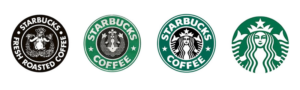
Starbucks logo iterations from 1971, 1987, 1992, 2011
With this in mind, to pass this checkpoint, you just need to understand what’s the lifespan of the design you’re analysing and judge it accordingly.
Is the design appropriate for it’s life span? If so, hang in there, there’re only three more check points to go. Read about them in the continuation of the article.